
Before we can really get into Painting with Your Rotary Cutter aka Making Prints Out of Solid Fabrics, we have to talk a bit about how to pick palette.
There are several different ways I that I pick palettes, but right now I am going to tell you what I know about picking a palette where I am using only solid fabrics and where each color of those solid fabrics will be equally represented in the final “fabric” or composition that I make.
Here are some examples of working this way. Birch Woods Glimmer is a palette of neutrals with a few wild cards thrown in.

 Ablation is a palette of blues with a few wild cards thrown in.

 Do a Little Dance has five seperate color palettes.

 When I pick a palette of this sort I think about three things.
1. Creating a BEAUTIFUL palette
2. Creating an UNUSUAL palette
3. Creating a palette where each color HOLDS ITS OWN.
By that I mean that no matter where a color lands in the composition it still has the ability to be seen.
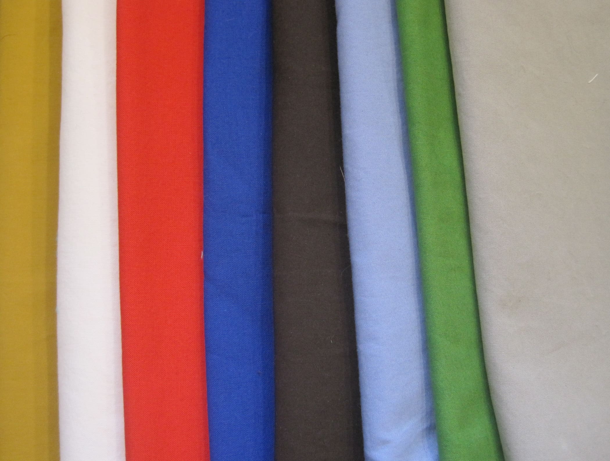
I store my fabric in what I call my fabric filing system. Here are 16 files.
 I have about 80 files in my studio. My print stash is much larger than my solid stash. As I pull a palette, I pull my files out and look through them searching for interesting combinations. Here is the inside of a file.
 I usually select between eight and twelve fabrics, and I try to always work with an even number.
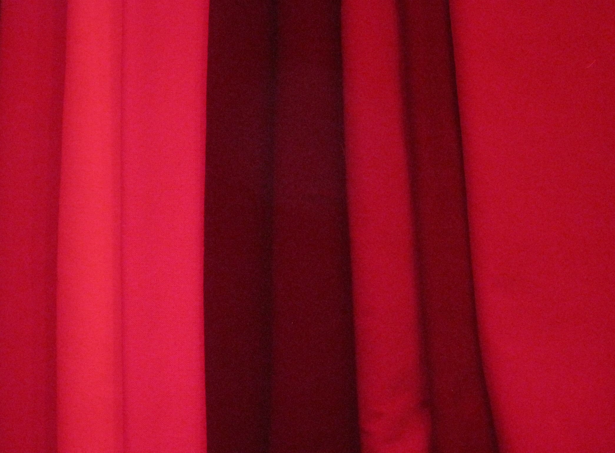
Once I get a palette that I think might work, I fold the fabrics and rest them on top of each other.I want an equal amount of each color to be visible. I am doing this as a test. These fabrics will all exist together in equal amounts in the final “fabric” or composition. If I don’t like how they look now, I know it will not work later. Selecting a palette is the most important step of a composition. If your colors aren’t good, you are doomed to ugliness. That said, you can take away fabrics and splice new ones in, but is always better to start out strong with a lovely palette.
 If I don’t like what I see, I add and subtract until I do. This can be a painful process. I find that I select color intuitively and listening to the non-verbal side of my brain try and communicate what it likes can be exhausting.
Once I find a palette that is both BEAUTIFUL and UNUSUAL, I must then challenge it to see if each color HOLDS IT OWN. I move the fabrics around and see how they interact with other bedfellows. I often think of my stitching as “marrying” two fabrics together. But building a palette like this is not a traditional marriage it is a polygamous one. Everyone is sleeping with everyone. I do not want anyone arguing or feeling left out.
 If I am satisfied, I pull out my value finder and see what that tells me.
 When I first started making quilts, I used my Value Finder all the time. Now I use it only when I can’t seem to figure things out on my own. When you are using a value finder you must always remember that Red is a pathological liar and Yellow is her friend. The value finder has a hard time getting them to tell the truth. For this reason, you should always use the value finder in conjunction with your own eyes.
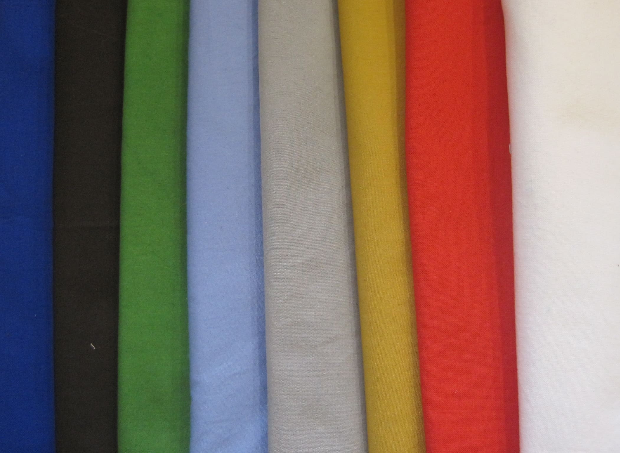
I arrange them by value moving from dark to light.
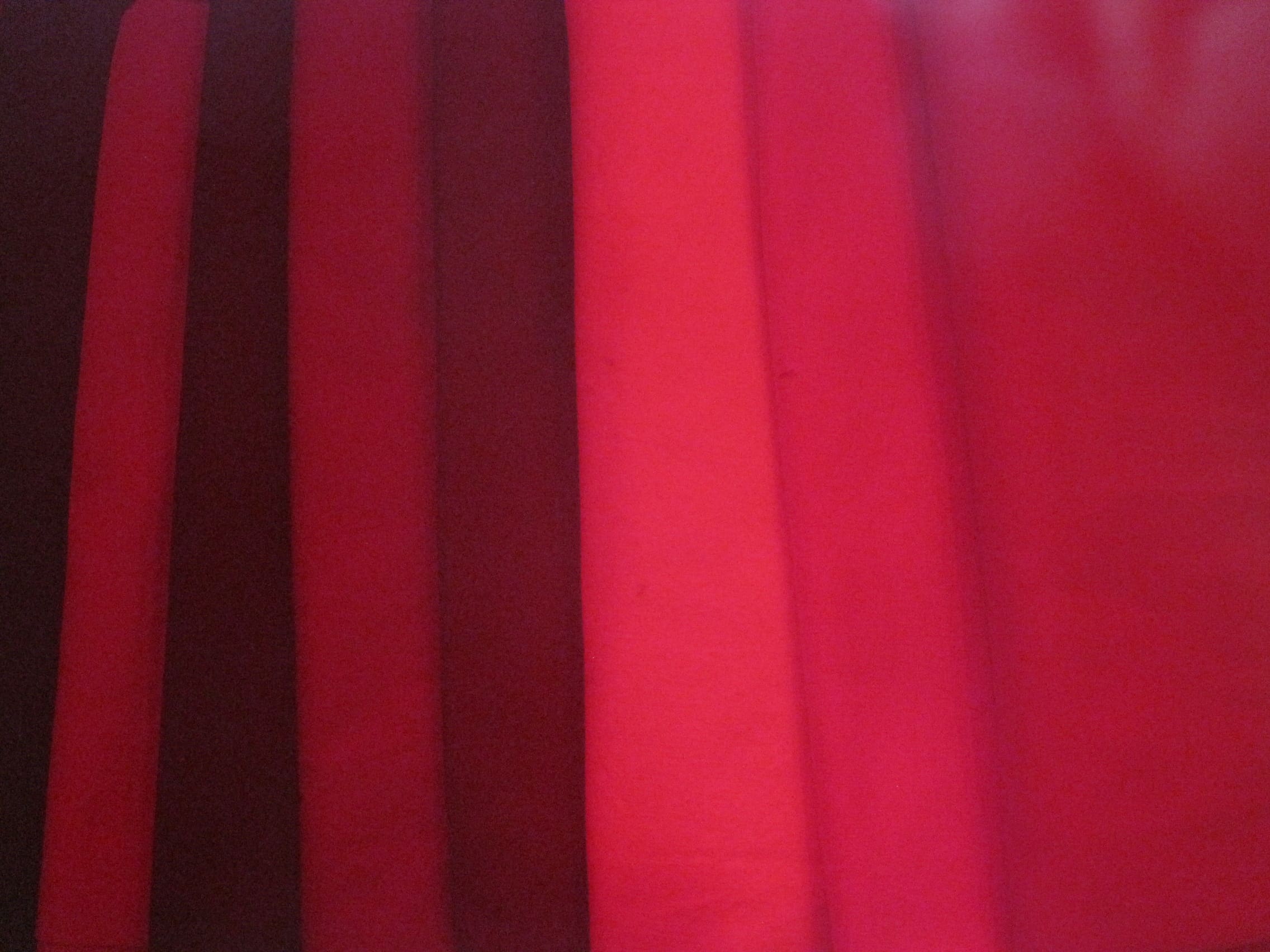
 I check my work with the Value Finder.
 I arrange them so that they move back and forth between dark and light values.
 And again with the Value Finder.
 I do notice that the relationship between the light blue and the grey is not exactly as dynamic as I would like, but over all the effect is pleasing. I go with it.
 When I am creating these palettes sometimes I will try and work towards a palette that evokes a particular season, or culture, or time period. In fact, I did that with this palette. I wanted it to feel like a take on a southwest color scheme.
Several years ago, I found this book at Title Wave a wonderful used bookstore here in Anchorage. I find it very helpful when looking for unusual and/or authentic color schemes.
 I did not use the book for creating this palette, but when I checked my work, I see that I was pretty darn close.
 How do you pick a palette? Do you do something similar or totally different?

oh great I painted my cabin red and yellow… a pathological liar and her friend… some neighbor you have. gma patt
patricia garrett, lcsw
box 671643
chugiak, ak 99567
907-854-7288
Date: Thu, 14 Nov 2013 01:42:42 +0000 To: pmgarrett@hotmail.com
It keeps the neighhborhood interesting Grandma Patt!
Oh, Maria! You are such a natural colorist, and thank you for sharing this post. I like to choose colors intuitively, and since working next to you for a week, I am paying close attention to good contrasts in value…. Light against dark, gotta have it! ThAnk you again, this post is really helpful.
Being your neighbor was one of the best things about week two!
I use the monochrome setting on my digital camera to tell me the values, switching color to greys, rather than a red value finder, that way red can keep her honest reputation intact, yellow is no longer her accomplice and bright turquoise is put in its place!
Great advice Barb. Thank you for sharing it.
Thanks for addressing this topic. I’ve been thinking about palette a lot. It’s so important to the success of a piece. I am very conscious of value, but still find value “mistakes,” usually after assembling a large number of small pieces. 😉 I’ve been mulling over an idea recently; looking at favorite artwork, and starting a palette based on it. My current favorite book is a big fat collection of the Group of Seven. http://tinyurl.com/n5hdpxh
Their colors make me drool!
Maria, it is wonderful to read and see your thoughts about colors!
Thanks, and please keep writing! I am looking forward to read what you are writing
Rachel- You are too good to me. Thank you!
Pingback: Ruler Made Stripes | Maria Shell
Pingback: Mat Made Stripes | Maria Shell
Well well well! I have read a bit about colour and made a few things but now I think I’ll go back to square one with your approach. I want to make my bil a pair of pot holders for Christmas (big undertaking!? Not! Shouldn’t be anyway but I want them to be good, or even especially good, pot holders) So I’m reading all your old posts about colour and making fabric and giving myself time to experiment. Trouble is I’m thinking it may be hard to start small like that. Maybe I’ll make bigger and find bits of my “fabric” that I especially like?
Can I get a copy of your oven mitt pattern? Love this as a gift ideA.
Yes Joyce. I have them for sale now. I will email you the details.