
For the past week, I’ve been working with the Asia Freeman, the Artistic Director at the Bunnell Street Arts Center. We have been tweaking the various components of my show there.
Talking about logistics, the show name, hanging space as well as other details have made me fully realize–I am having a solo show. It is happening. TO ME.
The show is called CUT STITCH PRESS, and it will be at the Bunnell Street Arts Center in Homer, Alaska with an opening scheduled for February 7, 2014.
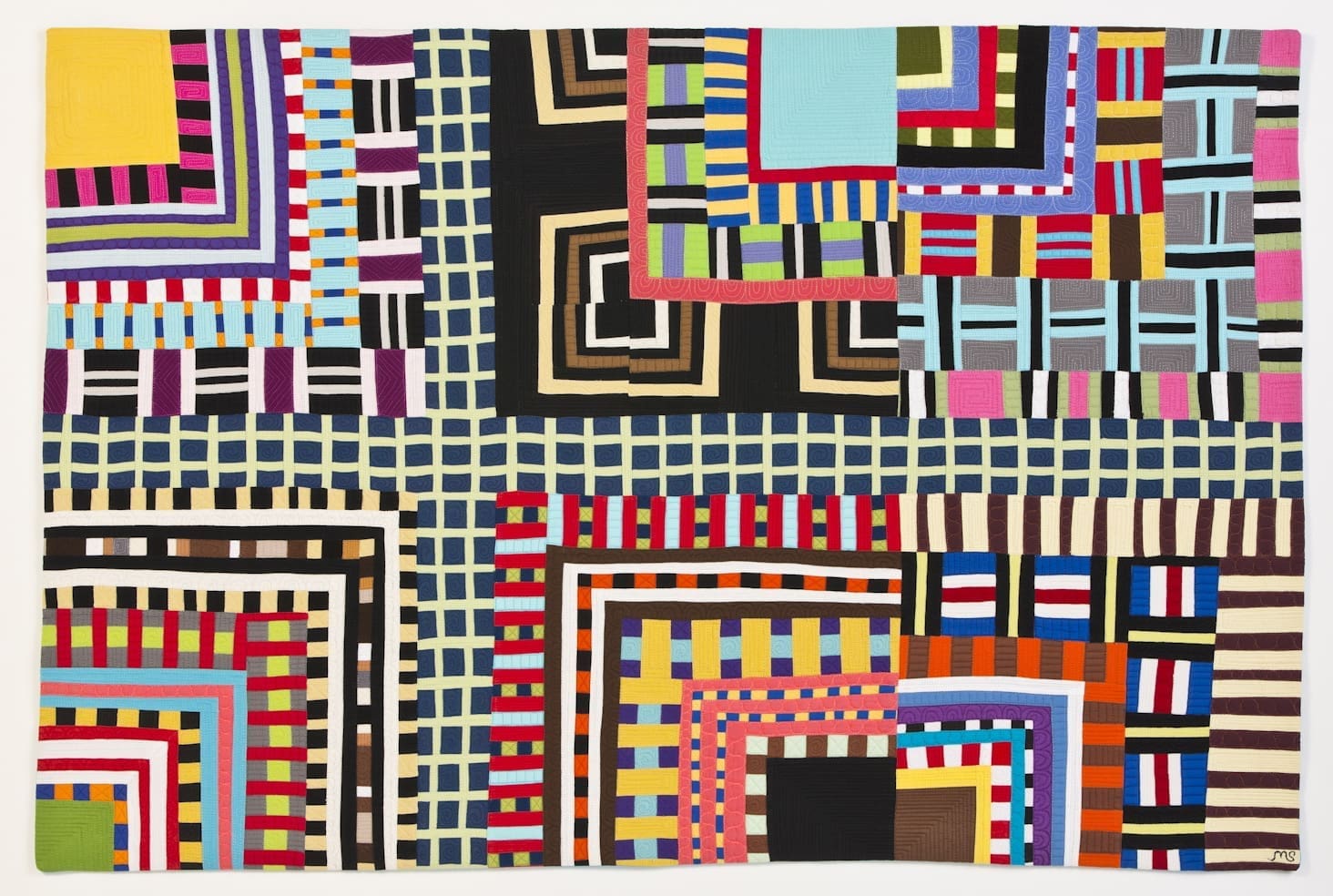
I needed to select several quilt images for the Bunnell website. I sent Asia an assortment of five quilts that I love and that make sense for this show. Asia then asked me to select one for promotional materials.
This is a hard thing for me to do. Each of these quilts has a special place in my heart. I thought about asking Walt and then choosing the one he didn’t recommend–which is kind of how our relationship works.
And then I thought, why not ask you to help? I bet you would know which image would be the best.
So, I am asking you to vote for your favorite.
Fiber Optics
48H x 48W

 Good Vibrations
50H x 46W

 Treasure Map
29H x 29W


 Way to Grace’s
25H x 25W

 Boulevard
32H x 48W
 Thank you for helping me choose!
PS- You have to vote, otherwise I will feel dumb for asking.
Thank you all for voting! It was great fun. Here is the final tabulations–
Treasure Map–2 Votes
Fiber Optics–4 Votes
Way to Grace’s–5 Votes
Good Vibrations–8 Votes
Boulevard–12 Votes
Boulevard Wins!
I must say the funny thing is that my favorite going in to this was Treasure Map which only received two votes, one of which was mine.

I’m chiming in with “Way To Grace’s”, because it’s so you, but my second choice is “Good Vibrations” because I think it would make a great poster. In just changed my vote to “Good Vibrations” . They are all so good.
Thank you Barb–you are right. I probably should have just asked Walt. Asking all you creatives just leads to 100 right answers!
Fiber Optics!
Thank you Kaci–I love my Christmas Card!
Dear Maria:
Congratulations!
They are all beautiful and amazing pieces of art!
I vote for Boulevard! It is really something!! Good luck!
Regards from Brazil
Renata- I do believe you are in the majority. Boulevard has part of Way to Grace’s in it. These things just seem to grow out of each other. Which keeps it interesting for me.
Boulevard! (1st choice)
Way to Grace’s (2nd choice)
As always it is good to hear from you Sue. Thank you for voting!
Hi Kaci Marjorie & I Like GOOD VIRATIONS
Thank you Dick for voting. I hope Kaci doesn’t get you in to too much trouble.
I vote for “Way to Grace’s.”
Sharon- I love Way to Grace’s. It is the quilt that lead to the Color Grid series which has been a great adventure for me.
#2 way to graces – it’s you
#1 boulevard – I think marketing would have many interesting and cool areas to use from this quilt.
Kerri- I wish I had your eyes in my studio on a regular basis. And your brain too. I just like the way you think.
Good vibrations.
Trudy–thank you for stopping by. Good Vibrations is always favorite for me. To me it represents the moment I really got how to work with color.
Boulevard
Mark- You picked the winner early on.
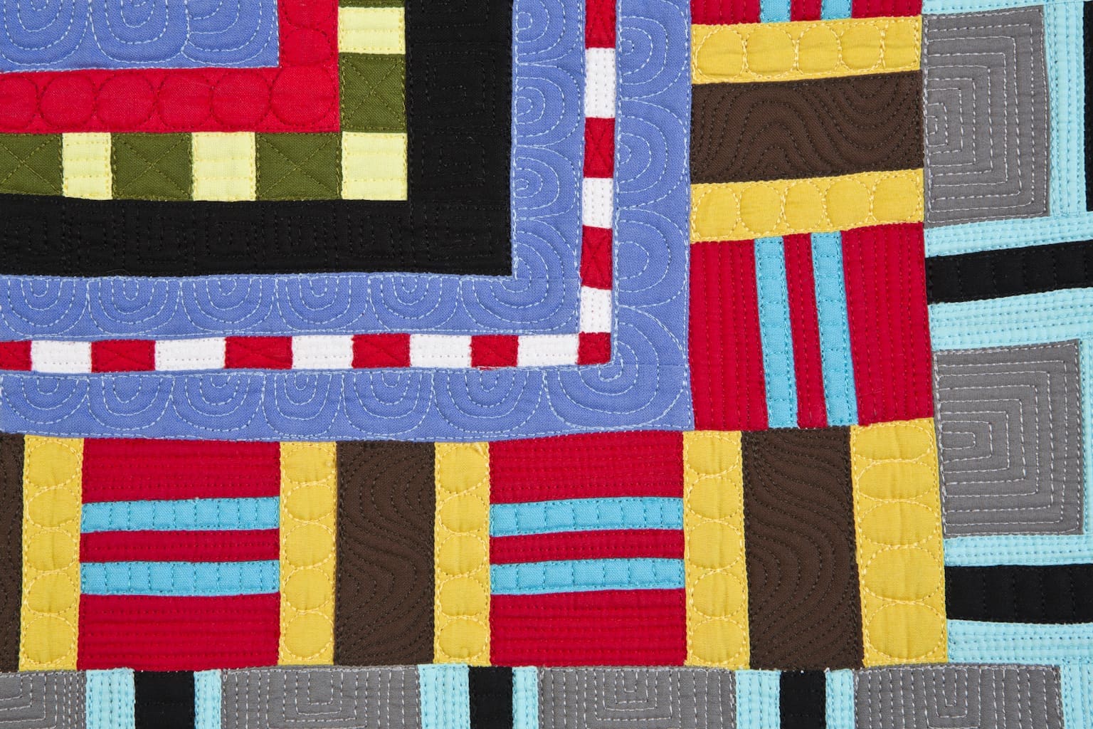
I like Good Vibrations for the lead image, but the swirly quilting photo draws me in, too. Made me laugh! You are cetainly not dumb. Overachiever maybe, but not dumb!
Thank you Denny. I am glad you stopped by.
Boulevard
Thank you Kathy for stopping by and voting. I’ve been thinking and thinking about the post you wrote about prints and solids.
treasure map. all the way.
Petra! Treasure Map was the one I would have picked. I am so surprised to see it get so few votes. Just you and me.
You’d best ask Walt.
Hi Maria… it is very hard to choose and I send my vote for BOULEVARD… because of the colour and complexity. As a marketing strategist, Fibre Optics is amazing- it’s the detail.
Bethany in frigid, but dry Kingston ON
I had not thought about looking for a piece that is good for marketing materials, but it makes total sense. I just was going to pick my favorite. Good points. Thank you from warm and wet Anchorage, Alaska.
I vote for Boulevard. It’s a tough call- they all look great.
Thank you Angela for stopping by, I think you are in the majority here.
I choose Good Vibrations or Boulevard..Can’t decide between the two.Best of luck for the show.Hope you. will post pix when it is up.
Thank you Sue for voting!
Way to Graces. In my opinion, it is the one that most clearly shows your voice.
Heather, you are right that Way to Grace’s is a true precursor to the Color Grid Series. In fact, Tribe (a quilt I just finished) is a blowing up of Way to Grace’s. Its interesting how our work circles around itself.
I like Good Vibrations. Think the movement and colour would look good as a publicity image. And then again how could you go wrong?!
Thank you Nysha for stopping by. I hope Thomas is doing great.
Fiberoptics is the most graphic, colorful and in my opinion would make a great cover ad or whatever she has in mind. It is funky, spontaneous, and says it all about your voice to me. The larger blocks of color with less zing than some of the smaller pieced ones invite one into the show and then your audience can see how versatile a quilter you really are.
Thank you Aunt Carole–it is a good one.
my favorite is Fiberoptics
Mary- thank you for stopping by. Fiber Optics has had a good show history and has always been a favorite of mine.
Very hard choice-Boulevard or Fiber Optics.
Thank you Colleen! You are in the majority here.
I vote for Good Vibrations. It’s representative of the work you’ll be exhibiting, and it’s “quiet” (if that word could ever be applied to your work) enough to allow for graphics, text, etc. to be on a poster or other advertising and still be seen.
Sharry- all good points! I hope you are doing good in snowtown.
#1 Boulevard and #2 Ways to Grace……looks like the votes are all over the place so far. Hope we don’t confuse you even more! Any of them are striking, so I don’t think you could go wrong. Good luck with the show…..
Carol-I have learned from this exercise that asking a bunch of creative types what they think leads to a lot of different answers! But it has been great fun, and I am grateful for all who have taken the time to comment.
Boulevard! (Though they’re all great:)
Thank you Elizabeth for stopping by. I think you are in the majority here.
My vote is for Way to Grace’s. As someone who has studied with Nancy Crow, I see Fiber Optics and Good Vibrations as related to her exercises. Way to Grace’,s and the similar quilts of yours I have seen, show a strong personal voice. Congratulations on your solo show!
Marni-
Thank you for stopping by my blog! Your observations are spot on. I feel the same way. I actually made Good Vibrations in my second week of study with Nancy, and then I went home and made Fiber Optics on my own. When I am left to my own devices, I tend to gravitate toward pattern and repetition, but during class Nancy always pulls me away from it. It is an ongoing battle for us.
Way to Grace’s gets my vote.
Relax and enjoy your own show!
Thanks Jan for voting. Way to Grace’s is a favorite of mine too.
Pingback: Image Journal #4 | Maria Shell
Pingback: An Invitation | Maria Shell