
Over the years, I have made lots–probably more than necessary–blue and white quilts. I didn’t do this intentionally. I love all colors, and most of my quilts are a testament to that statement.
Okay, while I do frequently say I LOVE all colors, that isn’t entirely true. In all honesty, who really likes those horrible home decor colors of the 1980s? That faux forest green and puke pink combo is, well, a sort of nadir in the world of color combinations.
 I found some examples of what I’m talking in an article on the Huffington Post titled “10 Reasons Why The 1980s were the Ugliest Decade for Everything”.
 Perhaps experiencing that time period as an adolescent is why I now obsess on beautiful color combinations. Somebody has got to make up for that decade.
I will say before I more on, this color talk has me thinking, I really should write some more posts about color and how it is an undeniably important aspect of beautiful work.
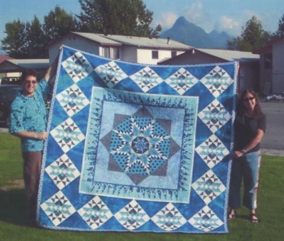
Shotgun or Quilt is the one of my first original designs. I drafted the feathered star center and all of the other borders on the quilt except for the final large border–those blocks were part of a Mystery Quilt pattern. This is the only photo I have of this quilt, and boy do I regret that. The quilt helped raise $5,000 dollars to cover a dear friend’s medical expenses. There were two prizes in the raffle. This quilt and shot gun. Now, that’s an Alaskan fundraiser.
 Scraptastic Stars is another very early original design. The scrappy binding was not a good idea, but I can see that my ability to use value as a compositional tool is improving.
 I string pieced blue and white scraps and then used my Tri-Recs ruler to piece the stars. (I love this ruler.)
 I taught this pattern several times at the Calico Whale in Valdez, Alaska. This is one of the first quilts I quilted on my long arm quilting machine.
 Chronologically, I believe Blue Grid is the next blue and white quilt.
 It is a Mystery Quilt. While the top was finished years ago, I just recently quilted it as part of last year’s Great Alaskan Quilt Out.
 And then I put away my prints and became a student of Nancy Crow’s. Ablation, which is a type of glacier ice, is one of the first quilts from this period.
 It is based on an exercise about getting small. Many students do this once and never again. I have returned to it many times making entire compositions out of micro-texture. The pieced “blocks” in Ablation are composed of four pieces and are about each one inch in size.


Force Field is an early Color Grid. There are many ideas in this quilt I would like to revisit.
 I am especially interested in the way the grid component of this quilt works. It is a traditionally structured quilt featuring blocks and sashing, yet it feels like something else entirely.
 Deep Blue Sea is also a Color Grid, but the format is much more recognizable than in Force Field.
 I love this quilt because it was one of the first Color Grids where I used prints again.
 Deep Blue Sea was made to be a grid that is a part of larger grid which was displayed at the Bellevue Art Museum’s Biennial High Fiber Diet.
 And course, I had to roll all of the bits from all of these quilts into another quilt. Solar Blue is my most recent blue and white quilt.
 It was the first quilt I made using only solar power at our cabin in McCarthy, Alaska. You can read about that experience here. I really feel Solar Blue is a culmination of my years of studying patchwork as a basis for figure-ground composition. If you look closely, you will see bits of the other blue quilts making appearances in Solar Blue.


It is one of my all time favorite pieces. Of course now I have to do something with the scraps from that quilt!

Thanks for the tour through your blue history. Fascinating!
Thank you Melanie for stopping by and commenting. I’m glad you enjoyed the quilts.
I love Solar Blue! What’s not to like? It’s wonky and wild, yet firmly based in the traditional, and very blue.
I like Solar Blue too! Thank you–wonky and wild is a high compliment in my book!
Maria, It is interesting to see the journey through the very traditional first quilt, to more abstract, and to circling back to more traditional but with a very modern edge. You clearly know your voice and how you love to express yourself in your art. Bravo!
Thank you Carol. Sometimes I get very caught up in seeing what is in front me instead of the big picture. Posts like this help me remember who I am and to trust THAT. Thank you for kind words.
I loooove the tri-recs tool too. And your blues. I have a kitchen sink-ish quilt I need to load on my long arm, but am waiting to hone my skills a bit more. I do think of you every time I look at it. Quilting is so much fun!
Thank you Jennifer! I think you are ready to quilt that quilt. You are natural on the long arm. I hope to get to see the set-up during the Valdez Quilt Festival!
Maria, I’m a little blue obsessed. We bought an old trawler and I am remaking the cushions in a wool fabric from Wales (the boat is named for my husband’s mother who passed away two years ago, her family was from Wales) This is the fabric which so reminds me of your quilt! The pattern is called Knot Garden in Indigo.
http://www.melintregwynt.co.uk/colours/blue/19023086
Wow. What a great website! So many of the fabrics are quilt like. Beautiful thread compositions. Good luck with all that industrial sewing!
I can never pick a favorite color either. I think it’s really closer to “I like all the colors, just not all the colors together”. Like that pink, ugh. But yet put it together with a particular gray, or a deep plum.. hmm. Ah, the 80s color decorating. But then the 70s would show up and challenge you for Worst Color Scheme title.
I like all your blue and whites! It’s a nice combo, it always seem to look so clean and precise and yet friendly and cool. Laughing at the Shotgun or Quilt awesomeness raffle. heh.
Thank you Carrie. It’s funny. I love the 70’s color combos, but a friend of mine told me that I wouldn’t love them if I had grown up with them. So, maybe there really is something to be said about how we associate colors (and prints for that matter) with certain moments in history, certain memories and emotions. Those 80’s colors are loaded with feelings–mostly teenage misery–for me. Perhaps that is why I have such a difficult time with them. I think you are right about colors being more “likable” in certain color combinations. Thank you for stopping by!
Hmm, that’s interesting. That means I should like those 80’s color combos then. But, yeah, not so much. Maybe it’s because I’ve just never been a big fan of big pastel florals?
I’m trying to think of what 90’s color trends were but google is just returning a bunch of neon brights, which honestly I associated strongly with the 80’s, not the 90’s. My bathroom, which I’m pretty sure dates all the way back to the 30’s, was probably the height of fashion with a pinkish-purple bathtub and sink in the same color, and tiling in mint green with that same purple contrast. Not what I would have chosen, but someone probably really loved that bathroom.
Wonderful post. It was interesting to see several quilts in blue along with the development of your style. What a great post to read and re-read.
Thank you Ann. Writing these kind of posts does give me some perspective on my work which is always good. Thanks for stopping by!
Carrie- I’m not sure why wordpress won’t allow me to directly respond to your comment, but this is what I want to say. I think I would LOVE your bathroom. I love the 90s even thought I can’t really remember what happened…. I guess the 90s platform shoes are back in style. I never realized they went out of style, but now I think I should stock up. What are the colors of the 90’s though? You are right. Neon is 1980s. I suppose the nineties are flannel plaids, black and some more black. Denim for sure, but what else? I’ll have to think on this. Something to ponder while in the studio today.